A Newbie UX Case Study : Splitwise App

Prologue
This is actually my first time of writing these kind of reports. While i realised that there will still many things to learn and many errors to encounter in this article (Also so sorry for awfully bad english skills) but hey one gotta try right? haha.
- The Challenge
In these post i would try my best to redesign one feature of Splitwise Apps that was required as one of my test for applying to a job. My process through out the making of the design and the whole understanding user may be quite hectic and not too ideal in the perspective of UX Design Process, by i would like to challenge myself as a wannabe UI Designer of my design thinking with all the limitation that is given for this project. - Limitation Upon This Challenge
A. Time ( Two days deadline)
B. Only Had Android Version
C. Data Reliability & Asumption Based
Stalking Part: The Splitwise App
A Bit About The Company (what i know so far)
While waiting for the assement test, i got to admit that i kind of expecting the usual kind of test where i am supposed to make new web or app from scratch. So i was both surprise and excited when first read the test and know that what i will need to do is redesign this apps called Splitwise that i never really know a single thing about. I spend quite some time to really try understand the App Concept and glad that i do.
This App premise are actually very simple,
Splitwise is a Providence, RI based company that makes it easy to split bills with friends and family. We organize all your shared expenses and IOUs in one place, so that everyone can see who they owe.
— — — quoted from their website, Splitwise.com. For me this are a really simple but strong premise for an App. I instantly can relate so much about this app and actually can find where this app will improve my life. As instance, i was always that part of the group who will give up at trying to fairly splits the bills we shared and prefer to pay more than i should. I know exactly what effort needs to be put when recollecting “payment receipt” after a holiday is well spent, not that we had any spirits left to do that tedious things, is it more of that we know that there will be miscalculation or this or that receipt that is no where to be found.
How this apps handle the split method and even recommending more option with more consideration to the subject and object of the shared expenses really win me over. I also salute their user-minded approach for making this apps connects its user in a different level. They really put in to table what user want to say to their apps. I have scrolled deep enough to their blog and feedback page and actually finding that the changes they made are often exactly the feature or bugs that their user report on or even ‘wish’. Even up until now, their feedback section in google store are still getting reply from its admin and i actually witness some of the complains that is already been fix or some new feature that been implement, so i can say that this company really do work to the max when talking about improvement.
The Features Offered
From my observation i see many feature and design that this app been trying on come and go so i could only talk about the apps version that i have now. In Big Picture, these apps can be broken down into two main feature:
Adding Bills:
in this feature, one can specify who dealing with certain expenses and this apps will do its calculation for you that in the end of the day you can finish off your debt or all that you owed in one big cash. This most striking thing about this feature is that its allow you to choose different kind of algorithm to actually spliting the expense. So far, there are five ways to split your expense accordingly. First of course to split is in equal, the second was a bit tricky-er that its allows you to split exact amount of the money spend on each person. The third really take it down notch when its allow you to assign percentage on each person depending how much the person spend. The fourth and fifth algorithm are respectively dividing it by shares and by adjustment, that truthfully i was not fully understand of.
Settle Up Payments:
This feature is what closed the deal of our debts or owed money. In India, Splitwise are partnering with online transaction company which make it possible for users to send the money on the go right away. Us version of this apps are also integrated with paypal and one other payment online company that ease the settlement process. For other country like mine, we can only closed our settlement outside the apps (by giving cash).
Who are its Users?
Since the start, i knew i wouldn’t have much time to actually do some comprehensive user research while also keeping up with the two days due of the design. So i know that these proposed design of mine will contain many of my asumption. One can make asumption but have to be at least a bit careful about it.
But before that i tried to get hands on with the application itself. I spend time to really seek its every elements and understand its very function. Based on that breakdown i finally get something in mind, and embark my journey to find the truth (haha). While i am ready to take on all the data from the internet i still want to try my chances to see my closest user opinion, but it turns out of all of my relatives and collague, only 5 ever encounter the app and actually used it. So since its imposible to meet and our work hours are variously different i conduct a question answer session via Line Messenger App, Of all the 5 people only 3 that already respond me and giving me actual answer. (Disclamer: At that time i already decide that my improvement will focused on the “Add Bill” Feature, so that the question are focused into that and vaguely about others part.)
Here are my question list:

Their answer (some full in English, some are mixed with Bahasa):


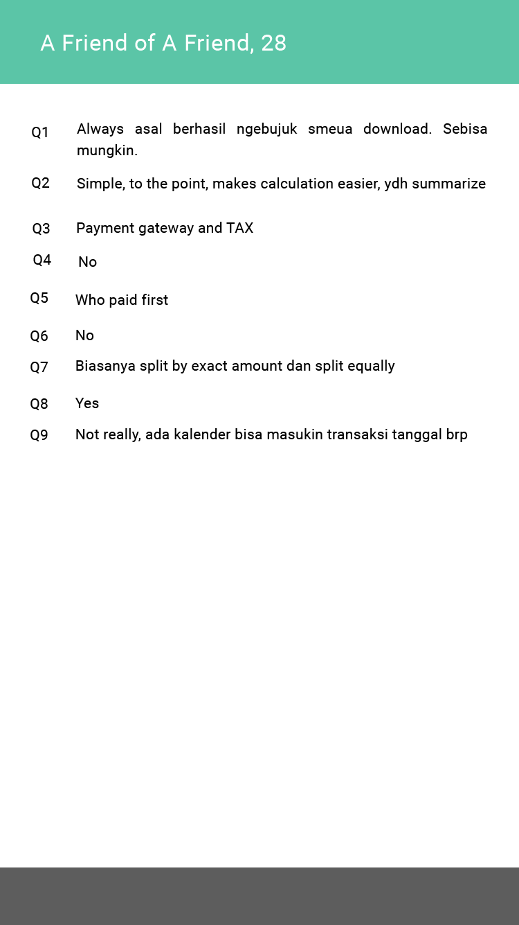
After getting a little data above, my next approach is that i need to read all the available review about this software and i also go to the pit where user tells developer what they feel: the comment section of app store. So the past two days i’ve been drowning my self with all the relevant review about the splitwise app (which i will list as reference later on) and making my way to the bottom of three app store, Apple store feedback, Amazon Costumer Review and Google Play Review.
Most of my valuable data which the i used to strengthen my asumption is the probably these comprehensive product reviews:
- Ho, Erica, 2014, Splitwise Is the Best Group Travel Expense Calculator, Accessed on 3 April 2018. (https://maphappy.org/2014/07/best-group-travel-expenses-calculator-ever-try-splitwise/)
- Prasad, Angkit, 2015, Product Breakdown: 3 Learnings from the Splitwise app, Accessed on 4 April 2018 (https://medium.com/product-breakdown/product-breakdown-3-learnings-from-the-splitwise-app-737096efc5a0)
- Singh, Arushi, 2017, Can we make Splitwise a bit “wiser”?, Accessed on 4 April 2018, (https://blog.prototypr.io/can-we-make-splitwise-a-bit-more-wiser-1da8bb678446)
- Kumthekar,Tanvi, 2017, Splitwise: a UX case study, Accessed on 4 April 2018, (https://uxdesign.cc/splitwise-a-ux-case-study-dc2581971226)
The User Persona
After spending time with all those data, I try to hang the red thread of them all and translating it into users persona. Here are the two of them:


Stalking Result: The Proposed Design
Selected feature to focused on:
For this project i set my focused on the Add Bill Feature. Why? Because i think that was the core feature of the Apps and maybe can have more improvement about the design itself. I found the design are a bit oldschool so i thought it was probably gonna be better and cleaner if i adjust some material design principles into the apps. (well i tried my best to)
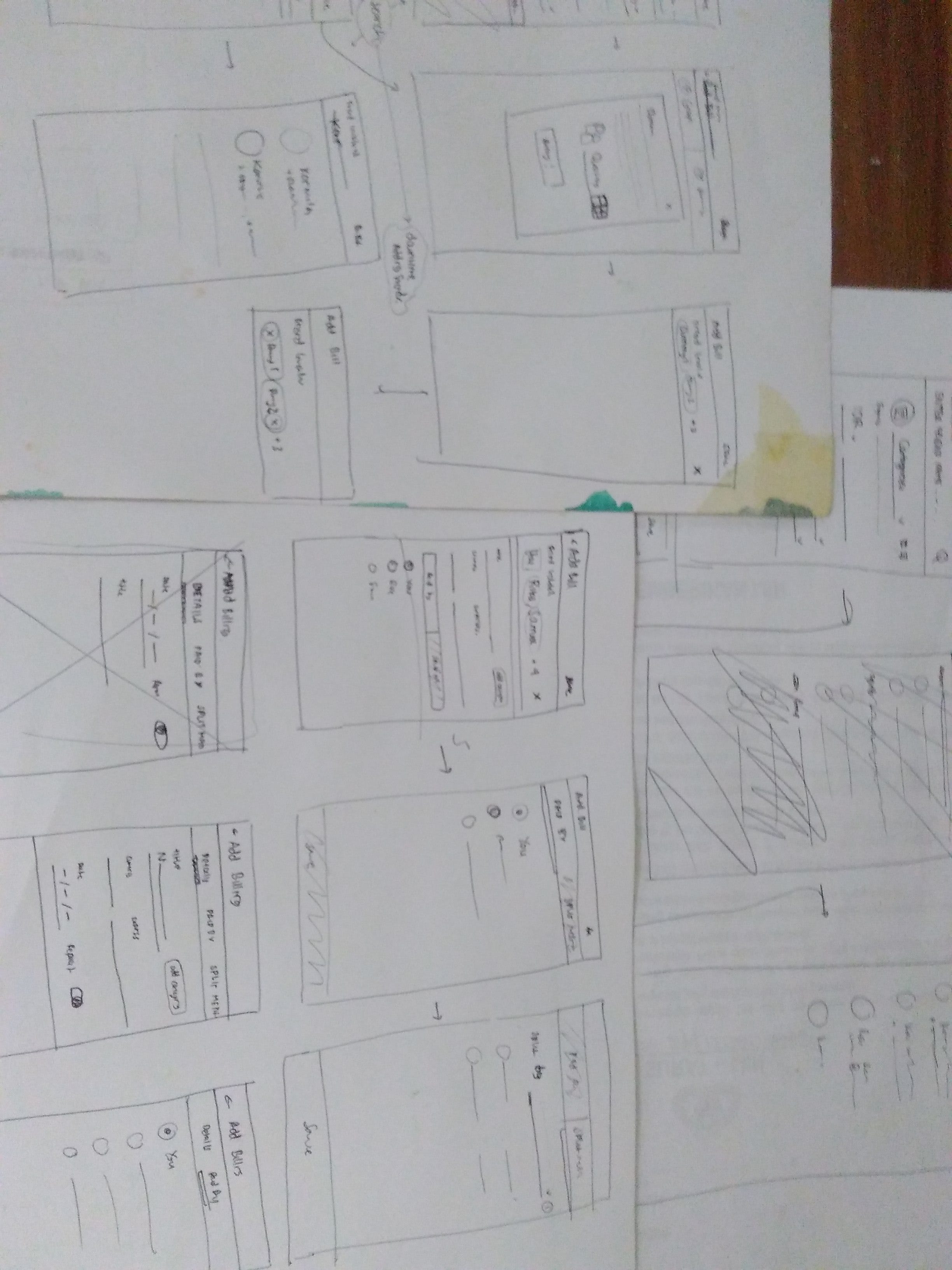
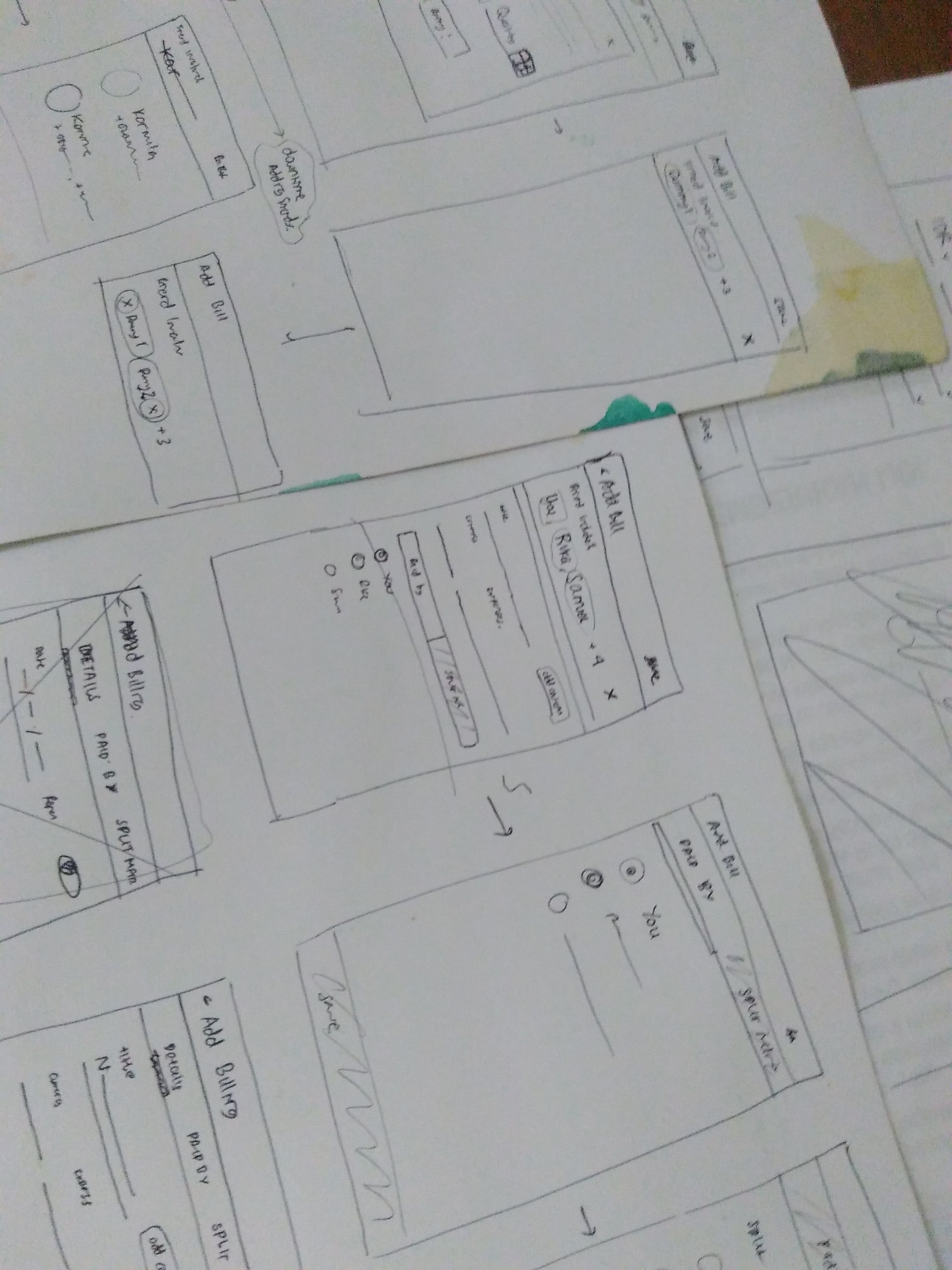
Below are my wireframing process to give solution for the problem that i will try to explain more in below article. You can access the prototype that i have made via marvel app in this link: Splitwise Prototype.
Problem #0: Elements Redesign & Copywriting
When i first explore this app, the most obvious things that may need improvements are its design consistency. I found it sometimes a bit inconsistence or perhaps not too obvious. Like the way the “YOU” and “EQUALLY” also the currency role to become somekind of a button are a bit risky for me. Some people maybe with the bright screen contrast or other factors are expose to the danger of missing out this feature. Its not look like other button that they have for “settle up” or “delete expenses” etc so people may get confused.
Also, i personally had missed the category feature which can only be accesed by clicking the icon to the left of the “Enter a description.” While the category itself in my observation really don’t add any convinience for the user because the lack of filter and seacrh feature in the Billing List, i thought it actually can be really useful once we can get the filter working. I imagine the case was probably for those who had shared an apartment or so because there may be some miscommunication about how to give the title of certain things that are shared daily need and will lead to duplicity, like one may just say cold drinks while the others when creating the same product in their group expenses may specify it with its brand. So therefore, i really think that category feature are actually mandatory to give more sense into shared product. I also seen a couples review where many neglect the usage of the date form (calendar icon in the below navbar), and again that is equally not convinience as the category since the filter feature are missing.
Therefore in my proposed design i try to simplify each feature and make it more obvious and less hidden. Like how i put category beside the title and like how the date and repeat (recurence) are made more accessible than hiding inside the calender app.


I also think that while the original design give of experience with to many pop-ups, where the button “YOU” and “EQUALLY” and most of the icon will lead to pop up and another pop up, i thought that maybe i could change and divide the interaction. In my asumption, along with the three interview (well if you can call it that) i find that most people will at least specify who paid first before do the spliting method. Therefore, i try to divide them into that order while implementing google material principle. I actually inspired by the apps google play itself which differ book, movies, games by a tab and you can just tap or swap it.
Although my concern is that, even though i try to keep it simple, i am afraid that maybe by dividing things actually making people feel that the process is tedious because of many screen not the simple back to back pop up. This is the concern of mine that i am still investigating the best way of it.
Problem #1: How long it takes to specify everyone that involve in a single expenses.
As i research the main pain points i found most people are aware of how inconvenience it is to not having such search and filter feature. And what makes me more surprised is how that those feature are actually made but only for those who had upgrade to pro (somehow). I think the worse part is that we doesnt event know what “pro” program can offer.


While those ‘pro’ program mentioned are only for the search filter, i then stumble upon the ‘fake friend’ act that Splitwise actually suggest one of the users do. Agree with most of the user, I also think it a bit pains me that when creating the bill we have to carefully and one by one adding those friend that involved in the expenses (worse if not all of them using it so we had to invite them, which means more pop up to encounter). So that maybe if they have that feature, they can actually make it to be ‘another good things’ about being pro, WHILE actually make those option visible.
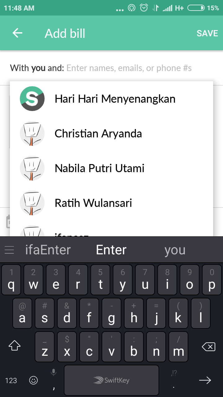


I am not dealing with the search feature yet, since in the add billing feature the only searching you need is for collecting friends and its already there so convinience enough. Here i try to adapt those ideas for the fake friend feature as ‘dummy’ and this time i assume it as a pro feature and you can actually see the offer within the apps it self.
Problem #2: Split Option are not clearly
In the original design of the apps, when the pop up “How was the bill split?” the pop up hides other split method in more option. Also when you actually do access the split method it doesn’t really tell you anything about the split method itself. While users will understand and make sense of it once they choose it from the dropdown, i think its probably better if there were more explaination about how the app split by all that option. ESPECIALLY about the least used option (that i know from asking those three friends) that is split by shares and split by adjustment. In my quick research i also stumble upon these comments: (this was actually taken from my first reference.)

In my assumption her problem can actually be fix by the split by share option, but she maybe haven’t figured that out yet or that maybe the method are not yet available at that time. Regardless, i think its probably better if all the method had some info on them and how to used it. Because from what i know, i found that Splitwise have research and come up with those method with great effort, so why not make it more obvious and understandable. In my design i add icon i for information, so that users can click it and read short explanation, i also made avalilable some context of how the splitting works by adding short summary like “$123.4/person” or “0.0% left of 100.0%”.


My downfall of the design is that i totally forgot to include “split by adjustment” and i still am abit confused on where should i put “you owe __ $40.00” or “___ owes you $40.00” option, maybe i can include them along with the dropdown example before or i need to come up with some obvious way so that users instintively understand that there are those option.
Problem #3: Recurrencing Expense feature are hidden in Calendar
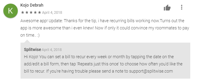
The same way that sometimes split method are hidden in ‘more option’ category, the option to made the expense repeated by month, or years etc are can only be found in date icon ‘today’ that exist in the left bottom navbar of my first picture. While most people does not even bother to set their date for the bill they created, i think this recurrence option can be real helpful when making expense with roomate or etc.


In my design i change both the date option and reccurence into simple form, so that it is instantly obvious that these option are available. I also change the way we change the date, instead of scrolling to the last date or month or year of the bill you forget to add, i offer solution by giving a calender like option (adapting from google designs). if you want to change the month or year you could easily tap on the month and it will give you some dropdown to choose month and year from.
Quick Reflection
I am still bad at writing and more than once i failed to actually try explained things efficiently. My research upon some subject are actually not deep enough so all my changes could create some risk and effect for users that i probably haven’t even think of yet. Regardless i am very glad that by taking this opportunity i’ve been pushing myself to actually think carefully and find the data that maybe relevant to my thinking to both confirm it or dismiss it. I still and will always learning for better ways to deliver reports and making a better design processs and result.
Thank you for you, who had read until this last bit. I really apreciate that someone really spend their time to read this newbie experiment of mine.
Thank you.


